Important new releases and news in the comic sector
Privat by Bravo
Bildunterschrift
Winfried Weiser by Bravo
Reprodukt
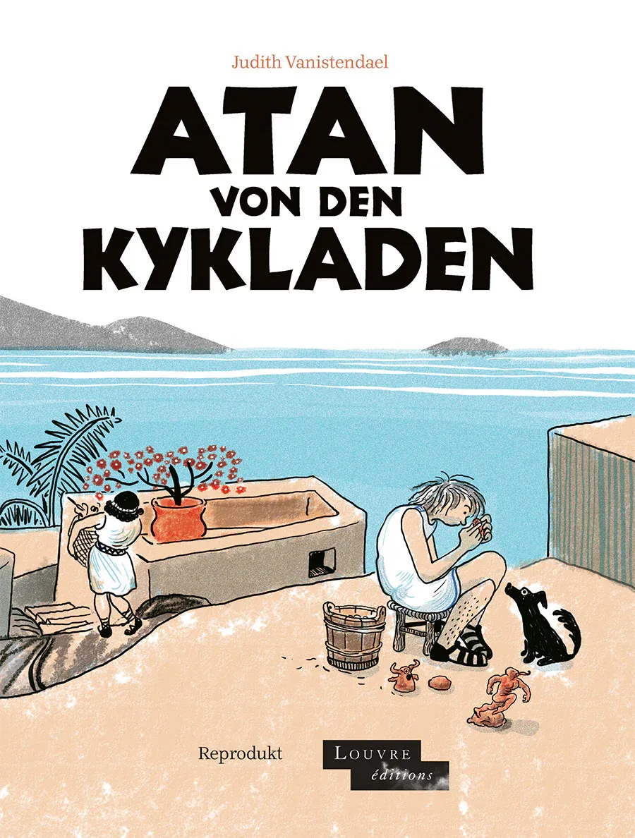
Judith Vanistendael | Atan of the Cyclades | Reproduct | 128 pages | 22 EUR
My favorite little comic: Sometimes in museums, it's not the iconographic works that catch the eye and hold our attention. A small, seemingly inconspicuous object can draw us to a display case and touch us emotionally. Judith Vanistendael may have felt the same way in the Louvre when she was captivated by a statuette in the Department of Greek, Etruscan and Roman Antiquities. Who, some 5000 years ago, had created this little idol? Who had owned it, admired it, loved it? What was its significance back then? These and similar questions must have preoccupied the Belgian comic artist and never left her, so she gave us - and herself - an answer in the form of a small graphic novel. The result is the lovingly designed and calmly narrated volume Atan from the Cyclades: an atmospheric coming-of-age story about the development of creative abilities and the people who pave the way for them.
Reprodukt
Atan...
There's no action here, no exciting plot. However, with empathy for the characters, the tale follows talented young craftsman Atan from his home island to neighborouring Naxos, where he is apprenticed to a well-known sculptor. There, together with fellow apprentice Rivo, he moves through each stage of his own artistic development. Of course, he also has to do the usual work of an apprentice (see picture on the left), but he is supported by Rivo and his master, who recognises his talent and encourages his development. The master even challenges him to break the boundaries of his knowledge and create something new that only he can see in the stone. In this way, Atan can ultimately go from craftsman to artist.
Fluently drawn with quick strokes, in a modern Franco-Belgian style similar to that favoured by Joann Sfar or Catherine Meurisse, the plot unfolds without the use of classic panels. This increases reading speed and sometimes allows the images to flow seamlessly into one another, making the volume graphically impressive too.
At the end of the book there is a short essay on Cycladic art written by Fabrice Douar, a curator at the Louvre. In it, you can also see images of the stelae that inspired Judith Vanistendael to create this small, fine graphic novel.
Refreshing clarity: The magazine Alfonz has now established itself as the leading voice of comics journalism in Germany. In addition to technically accurate background reports and features, there are of course useful reviews as well as clear statements on developments in the German comic scene. In particular, the commentary 'With art at the end' about this year's awards at the Max-und-Moritz-Gala at the Comic-Salon in Erlangen must have struck a chord with many comic fans. In it, Björn Bischoff laments the elitist escapism of the jury, which wants to distance itself from the "stuff that the public reads" in order to draw a non-existent line between "serious 'graphic literature' and comics." One aspect of the criticism is that this year in particular, the jury is going the way of unconditional political correctness and overlooking the idea that "an excellent work [should also]entertain", especially in the case of comics. The Comic Salon jury are in danger of straying from the path that defines comics as popular visual narratives. The fact that walking this path was also "not so much about the quality of the works, but only about [this very] demarcation" is another serious point of criticism. As an "open, friendly, colourful festival", the most important German comic event must therefore be especially duty bound to not appeal only "to a small and exclusive circle" with its award, otherwise the Max and Moritz Prize will go down the exact route that the Comic Salon never wanted to: namely to be an "event exclusively for comic geeks". And it is precisely on the basis of this observation that Alfonz also celebrates Tobi Dahmen's graphic novel Columbusstraße, just a few pages further on, as a strong piece of cultural memory just a few pages further on. Here, the balance between content and thoroughly entertaining narrative is achieved in an exemplary manner. And this is just one of a whole series of award-worthy new publications from last year.
Reprodukt
Manu Larcenet / Cormac McCarthy | The Road | Reprodukt | 160 Seiten | 25 EUR
All good things come in threes: Did it really have to be? Cormac McCarthy's dystopia The Road, published in 2006, is probably one of the most important novels of our time for its archaic power. The book won the Pulitzer Prize and is ranked among the 100 best literary works of the 21st century by the Book Review, the New York Times literary supplement. Since the time of the novel's publication, the question of humanity detached from all social ties in a destroyed world has perhaps become even more topical. Hardly surprising that attempts were soon made to adapt the work for other media. In 2009, for example, it was made into a film directed by John Hillcoat and starring Viggo Mortensen. In October 2010,Daniel Sander from Spiegel online wrote "It's almost exactly like the book, and that's the problem: only almost. Not quite as harrowing, neither as moving. Added to this is an inappropriately intrusive soundtrack by Nick Cave and an unnecessary, explanatory voice-over. The film version of The Road is like a flawed but competently made copy: Always a second choice. good enough for those who don't know the original." If the bar is set so high, isn't another adaptation, this time into the comic book genre, automatically doomed to failure?
The stakes are high, which also raises the question of the necessity and added value of another version. It is precisely the sparseness of the original that poses the central problem here. Should and can the empty spaces in this literary work be 'fixed' and filled with images? Isn't it precisely through not showing and not saying that horror and anxiety build up time and time again ? Won't a comic book stumble here at least?
Reprodukt
It may well have done, if Manu Larcenet hadn't taken up the cause. Back in 2015, with Brodeck's Report based on Philippe Claudel's bestseller, he showed his sensitivity for a graphic take on a literary model. His rich style, honed in such diverse works as Dionjon or Return to the Country, enables him to create a confident visual language that is always appropriate for the respective subject. This is particularly evident in his magnum opus, the graphic novel series Blast, in which he probably also addresses his own psychological state of mind. In 2019, he said on French television: "I have a wonderful illness called bipolar disorder, which has had me in its grip since I was a child. Without the experience of my illness, I wouldn't have been able to tell this story."
This probably also applies to The Road, his latest book. Sympathetic to Cormac McCarthy's original, it tells of the hopeless wanderings of a father and his son through a completely destroyed America, constantly in search of food, shelter and a little warmth. And Larcenet is familiar with these depths from personal experience. His graphic work is always reminiscent of the engravings of Goya or Dürer: knights, death and the devil seem to be around every corner. The predominantly sharp black and white contrasts are subtly supplemented in some places by almost transparent coloured backgrounds. The result is a sombre sequence of images that speak for themselves and have almost no need of dialogue. This reduction corresponds graphically to McCarthy's lapidary linguistic style; catastrophes are often alluded to in or between the images, conjuring up moments of danger. Graphic voids are thus created, raising questions and reflecting the fears and worries of the two protagonists. The apocalypse is omnipresent.
So do all good things come in threes? Whether or not you have doubts about the cinematic adaptation, Manu Larcenet's adaptation of Cormac McCarthy's The Road is most definitely a masterpiece!
Avant Verlag
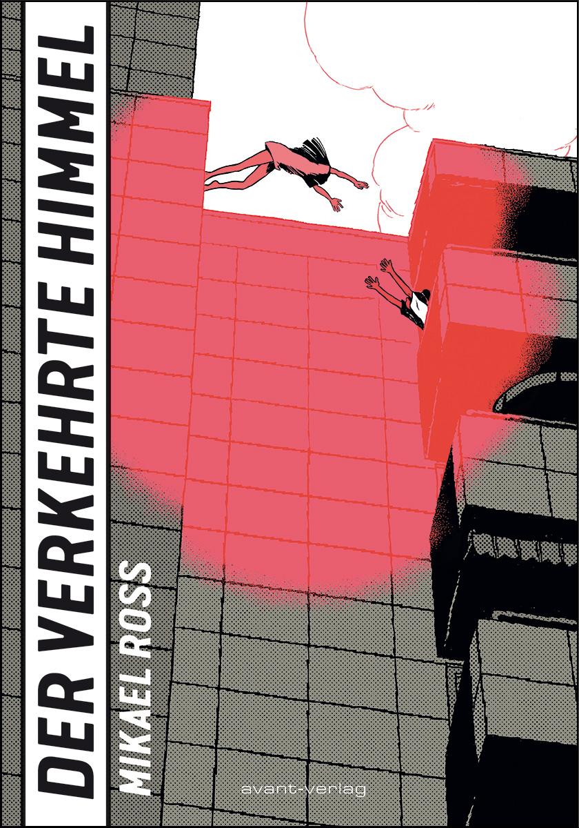
Mikael Ross | Der verkehrte Himmel | avant-Verlag | 344 pages | 28 EUR
No human being is illegal: Migration, flight and displacement are key themes of our time, stirring up emotions and even threatening to divide society. In his new graphic novel, Mikael Ross takes on this topic, in his fast-paced and complex way, telling the story from the perspective of children who get caught up in a rapidly uncontrollable maelstrom of smuggling, pimp violence and even murder.
Avant Verlag
It all starts harmlessly enough! At the so-called Polish market in Hohenwutzen, Vietnamese-born siblings Tâm and Dennis from Berlin have been sent to buy something cheap for their father. They decide to take advantage of this opportunity and pick up a bargain or two for themselves. It is here that they meet Hoa Binh, who is to be taken to Berlin by a trafficker. From this point on, a thriller unfolds, full of twists and turns, unobtrusive depictions of the surroundings and fast-paced action, in which a severed finger is just the beginning of an accelerating chain of events that however always stays within the bounds of credibility. It is no small feat that this complex story also works narratively. Mikael Ross skilfully links the multi-layered plots, letting them build towards a suspenseful showdown. He also weaves into the story a great deal of local Berlin colour, Vietnamese wisdom and spot-on humour. This is a testament to narrative mastery: pulp fiction meets sun and concrete.
In terms of drawing, Mikael Ross clearly leans towards a manga aesthetic that suits the fast-paced plot. It's not just his characters who are precisely sketched with a quick stroke - he also captures the essence of the prefabricated architecture or the allotment garden idyll of Berlin-Lichtenberg. Only when Tâm and Hoa Binh come close personally does Ross take the pace out of the action in his drawings and gives the reader and the two protagonists a breather. But there's a twist waiting on the very next page and the story picks up speed again: exciting, hilarious, informative, but never moralising and always fast-paced!
cross cult
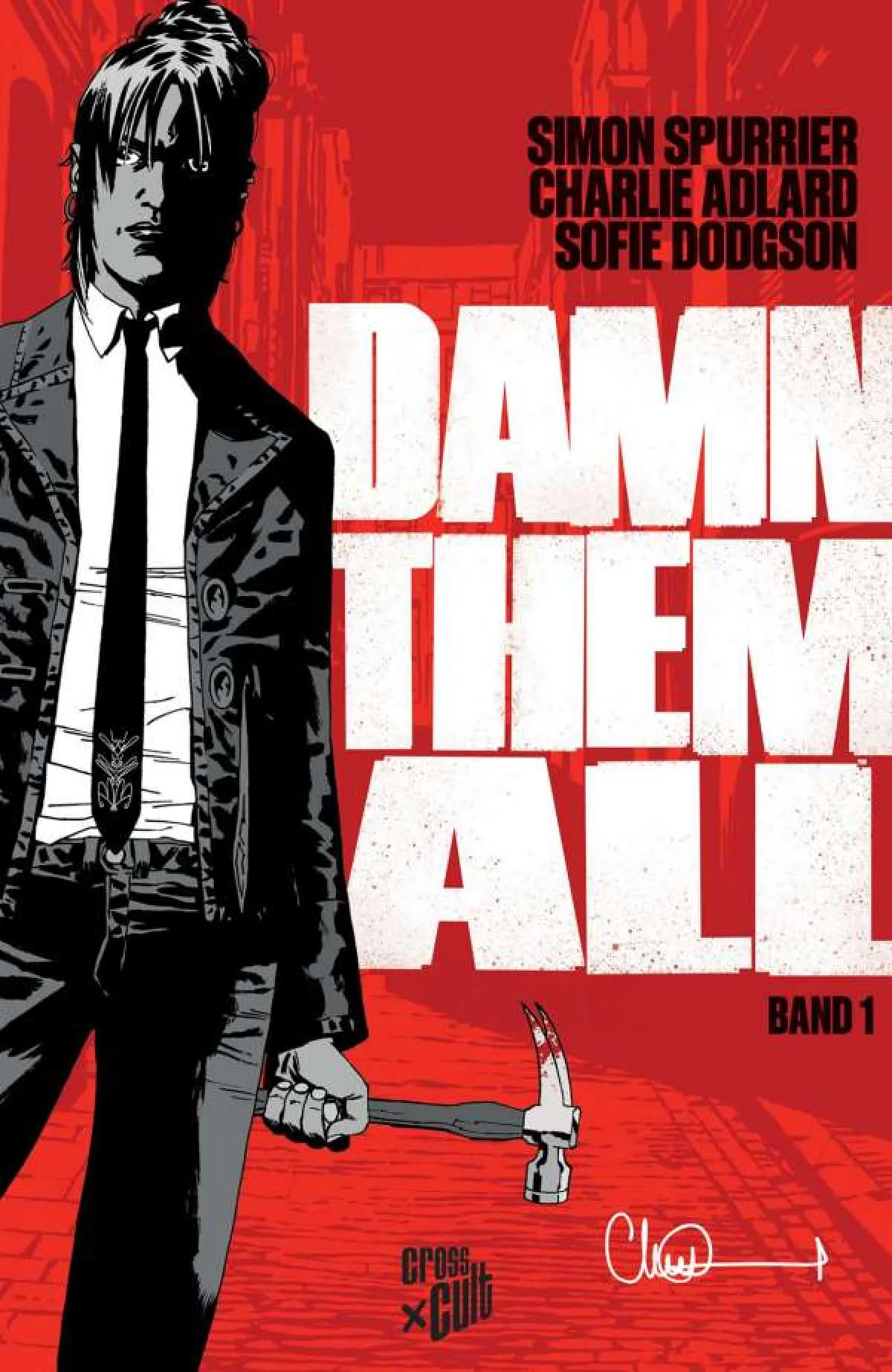
Simon Spurrier / Charlie Adlard | Damn Them All | cross cult | 176 pages | 22 EUR
Big names, even smaller returns: Two well-known names from the US comic industry have come together here: Simon Spurrier has already worked for Marvel, DC or Dark Horse, and for Damn Them All has teamed up with Charlie Adlard, illustrator of the X-Files comics and, above all, regular illustrator of Robert Kirkman's The Walking Dead. They take on the genre of mystery thrillers and demon hunts and try to breathe new life into it.
To start with, they use an interesting twist in terms of content. It is not the humans who are cursed and persecuted by the demons, as one might assume from the title of the series: here, the demons have been condemned to Earth and now roam around somewhat disoriented and helpless, until they are either magically sent back and thus quasi-redeemed, or controlled by a magician. But if this unpredictable power falls into the wrong hands, then all hell breaks loose on earth. Needless to say, various mafia gangs and magic circles are interested in this enormous potential.
Unfortunately, this thoroughly original initial idea fizzles out very quickly because the comic does not (yet) succeed in credibly bringing the central protagonists to life. The main characters remain uninteresting and seem more like plagiarisms. Ghost hunter and magician Ellie Hawthorne, for example, is constructed as an androgynous cross between the gangsters from Pulp Fiction and a John Constantine. Her characterisation is rather vague and her actions are often difficult to understand. For example, why she sells herself so cheaply to a second-rate gangster boss and surrounds herself with such peculiar sidekicks remains a mystery. The linguistic gibberish, which is supposed to imitate authentic gangster slang, also reads rather clumsily and is even unintentionally funny at times.
The artwork is also not really convincing. The depiction of the figures is imprecise, which is unfortunately often the result of the fast production conditions in US comics. The drawings look so sloppy and untidy. Ellie is more recognizable by her black suit than by her face, which seems to stretch in width and length. So one can only hope that the series will improve in quality and develop in both content and design. As it stands, it is neither interesting nor enjoyable to read.
schreiber&leser
Jean-Michel Beuriot / Philippe Richelle | To die for | writer&reader | 88 pages | 22,80 EUR
This will be nice in paradise:Jean-Michel Beuriot (illustrator) and Philippe Richelle (author) have given us the series Unter dem Hakenkreuz (in the original French: Amours Fragiles), a wonderful comic epic that follows its protagonists from Germany in 1932 to the post-war period of 1948. It tells the love story of the Jewish girl Katharina and the later Wehrmacht soldier Martin during the Nazi era. This bittersweet tale has now come to an end with the ninth volume. But fans of Beuriot / Richelle need not worry about long withdrawal symptoms.
schreiber&leser
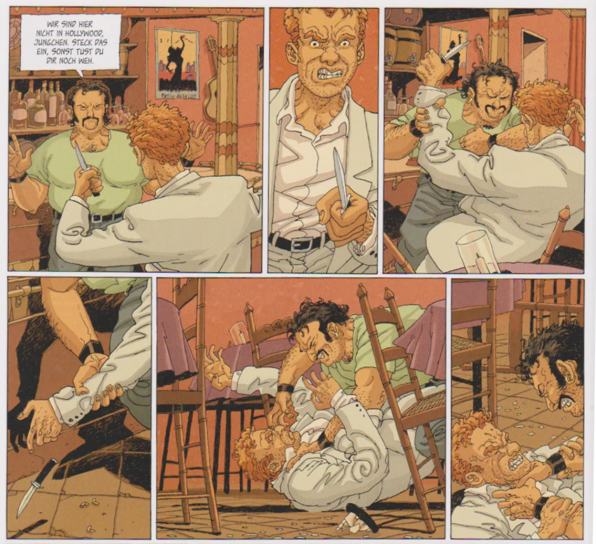
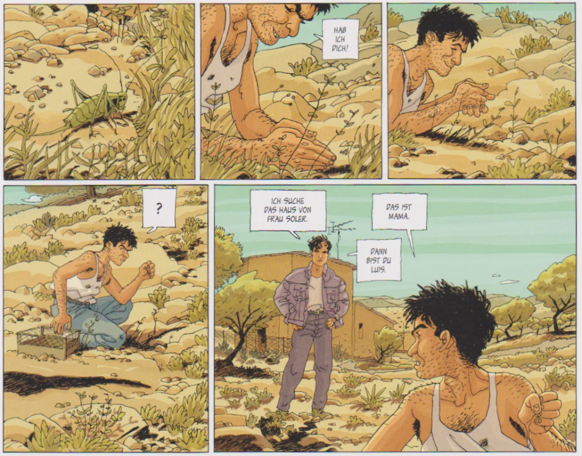
The publishing house schreiber+leser is releasing another volume by the duo with Zum Sterben schön . It draws on an earlier work by the comic artists from 1995, which already displays all the hallmarks of their work. The plot of this complex thriller impresses with its skillful and surprising interweaving of the different storylines: listless student Hugo receives a phone call in which he learns that a confused young woman has been picked up somewhere in the Andalusian hinterland with a note containing his telephone number. Not knowing the woman, Hugo sets out to solve the mystery. Hot on his heels is an unscrupulous man, obviously also on the hunt for this woman (see sequence of images on the left). From this basic constellation, an exiting road trip develops in which the paths of the protagonists constantly cross and diverge until the plot reaches a unexpected conclusion. Even while reading, you can't be too sure of your judgment of the characters, as many a clever plot twist repeatedly overturns assessments you thought were certain. And finally, the melancholy conclusion: it will be nice in paradise.
schreiber&leser
The confident drawing style is somewhere between Tardi, Prado, Pedrosa and Möbius, whereby characters are designed with fluid strokes and clear lines, realistically rendered on the one hand, but with faces which can quickly become grimaces when in emotional states of emergency (see above). The background is always detailed where it serves to set the mood and reduced where it would be distracting. The structure and layout of the panels cleverly guide the reader's perception and reading speed, and also invite them to linger over individual images (see images on the right). Fortunately the original colour scheme has been redesigned for the new edition, giving a clearer perception of image: ochre tones dominate the hot days, whilst a subtle purple dominates night-time. A wonderful stopgap until the next Beuriot / Richelle caper.


 Reprodukt
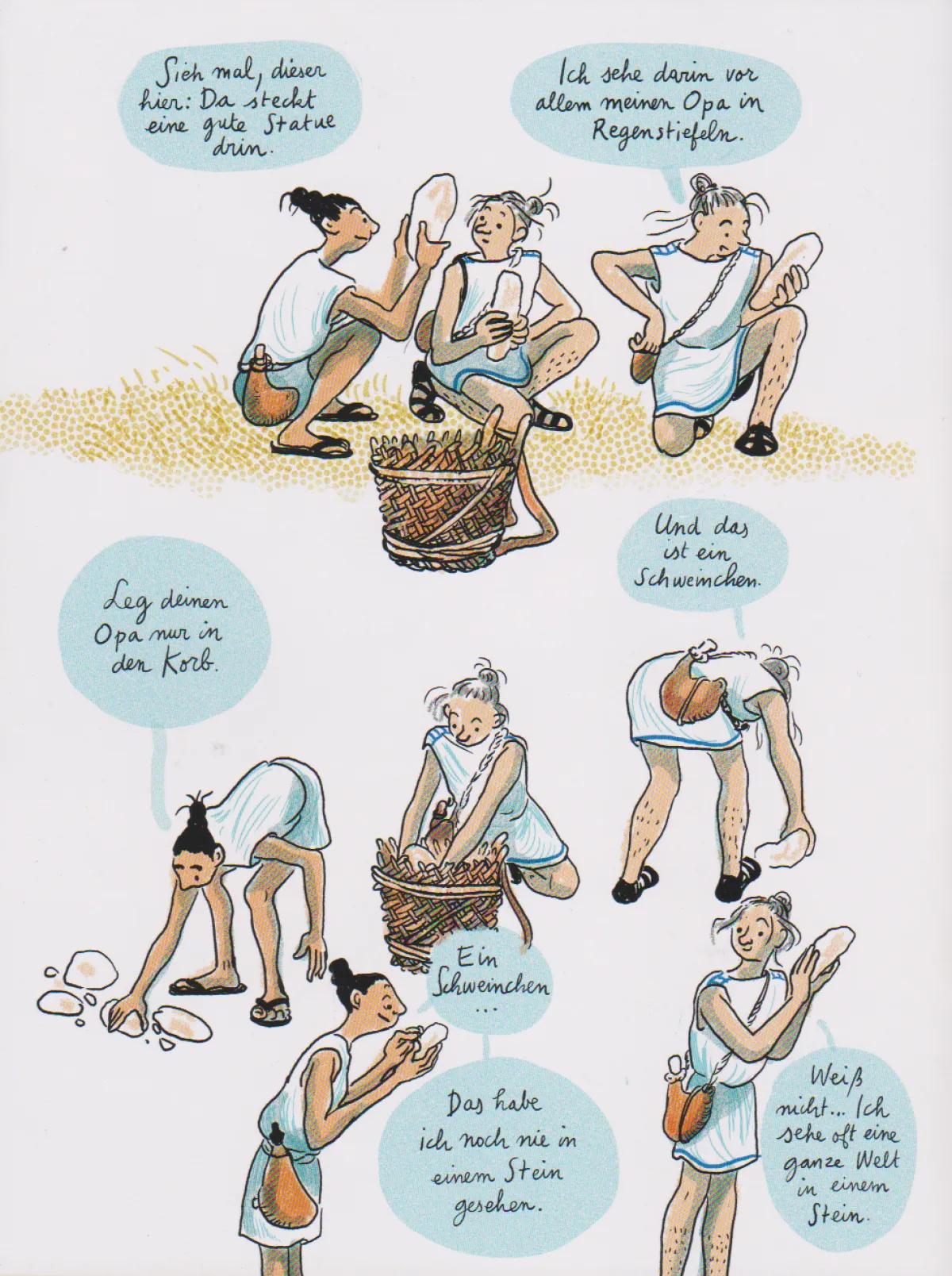
 Edition Alfons
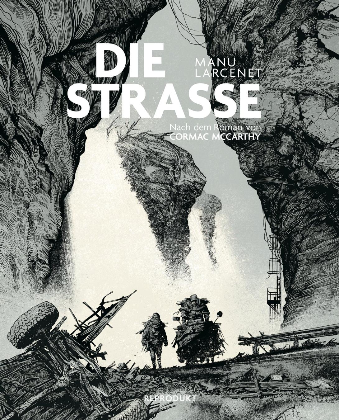 Reprodukt
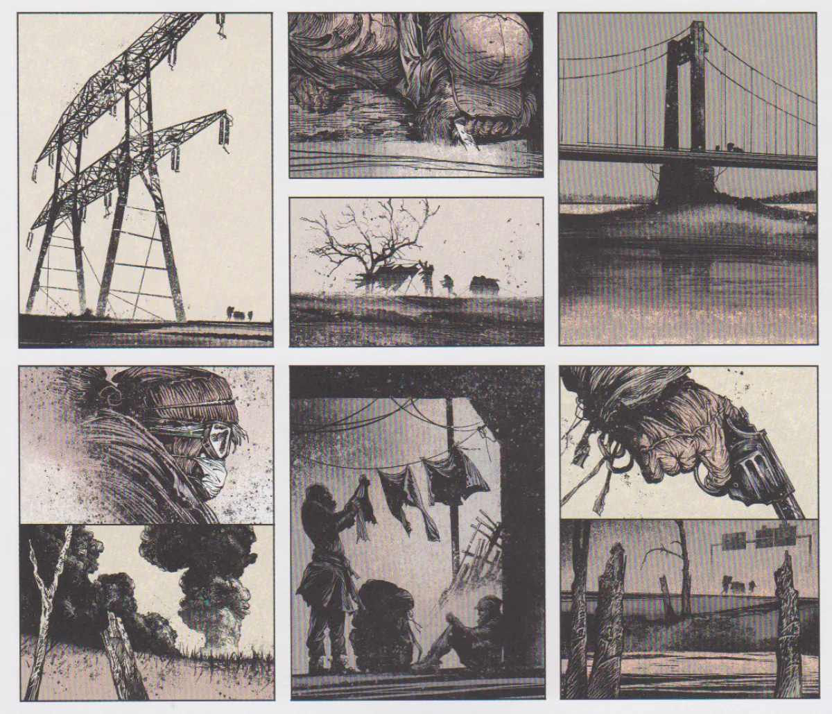
 Avant Verlag
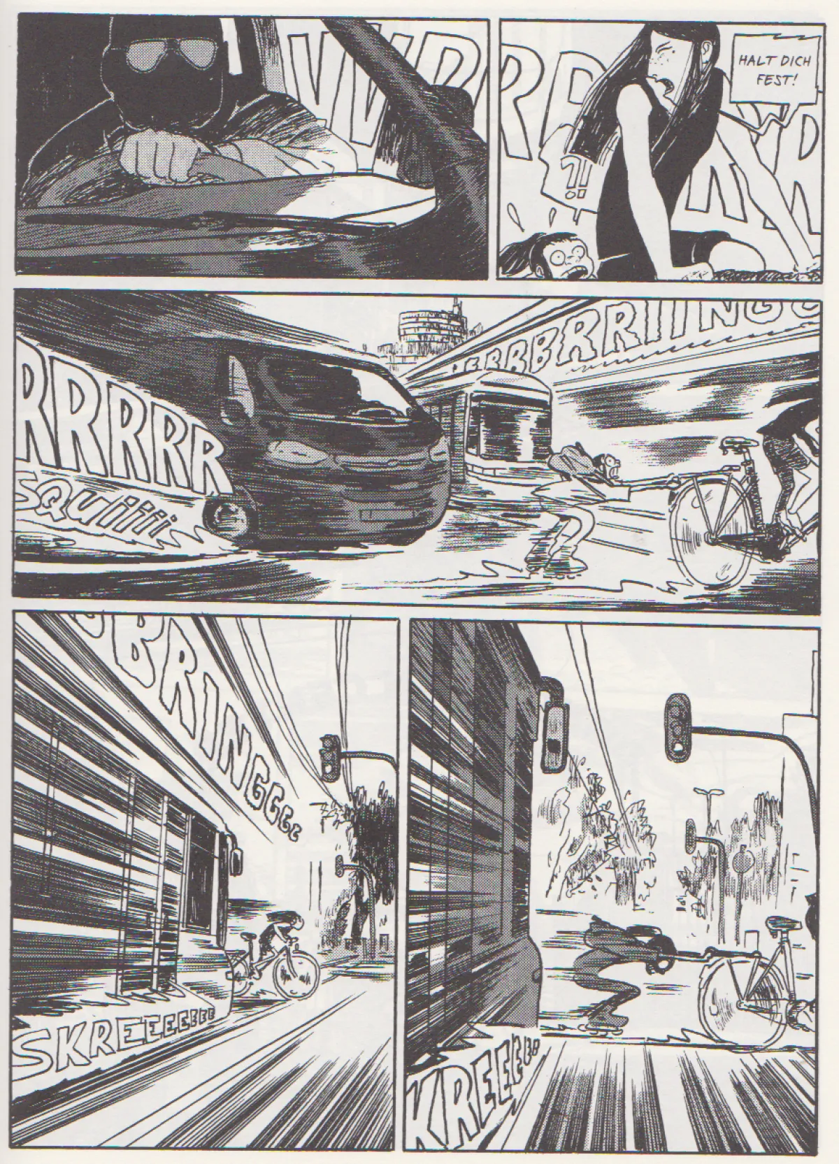
 cross cult
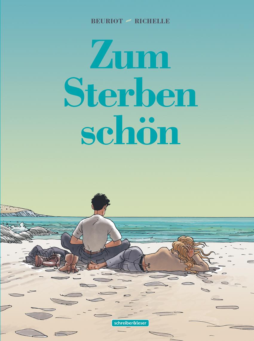 schreiber&leser