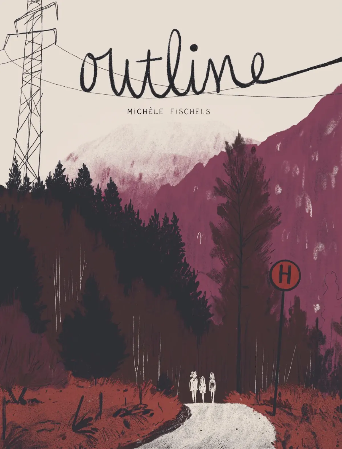
Michèle Fischels - Outline: Anyone who has ever attended a grammar school knows how important the choosing of a suitable motto can be for the entire year. After all, this year group are determined to demonstrate their importance and creativity to the world: "Wasabi - Scharf im Abgang" is therefore the statement of the group of students in question. The graphic novel tells the story of the final school year of a group of young people; the last school trip, the last party, the shifting dynamics and reorientations that arise as the uncertainty of their professional future approaches. Fischels follows the clique around Ben, Andreas and Clara as they grapple with both final exam preparation and university applications. Amidst all the confusion, there are also romantic breakups and new beginnings. School thus becomes both a door and a stepping stone for the protagonists: exams are looming, friendships are called into question and steps have to be taken to redefine the complicated web of relationships.
With Outline, Michele Fischels has created a work that fits into the booming genre of young adult literature, but pushes its boundaries in a new way. Her first book publication, Outline has already been awarded the Lynx of the Month September 2024 and the Lynx of the Year, awarded by Die Zeit and Radio Bremen. The plaudits said: "Fischels proves that the reticence of youth does not have to be the end of communication, but can be a beginning - full of pictures that say more than a thousand words." This sentence sums up the strength of Outline: its suggestive minimalism.
Fischels manages to treat these topics with subtlety and empathetic irony. Compared to Tillie Walden's On a Sunbeam, however, she dispenses with their epic, quasi fairytale narrative style and takes a more open, less narrated path. She dissolves the thoroughly structured plot in favour of an associative, almost diary-like structure. The panels sometimes seem like loose fragments of memory, but it is precisely their apparent disconnectedness that creates a larger whole.
The reduced line is reminiscent of the French tradition of artists such as Claire Bretécher and Catherine Meurisse, who also work with sparse lines and concise imagery. The nervous stroke of Gipi also shines through, especially in moments when the inner turmoil of the protagonists becomes visually tangible. The minimized lines and subtle use of colour underline the introspective character of the work. Her lines are simple but lively and avoid unnecessary ornamentation. However, this clarity is not an end in itself: it serves to emphasize the emotionality of the story and thus has an expressive function (see image above, p. 113).
Outline thus fits seamlessly into the boom in young adult literature, which is increasingly making use of graphic forms of expression. Fischels proves with her debut novel that she has a voice that should be heard, especially by young readers - and that her combination of image and text can create a resonant space. It will be interesting to see what topics the young artist turns to next, once she goes beyond the young-adult genre.
Gipi | Geschichten aus der Provinz | avant Verlag | 208 pages | 35 EUR
Not provincial at all! Gipi - Geschichten aus der Provinz: With Irgendwie und Sowieso, Franz Bogner created a cheerful if melancholic monument to the Bavarian province of 1980s television. This vague indeterminacy can also be found in Gipi's collection of stories. However, 20 years after the homely TV series, it is certainly not fun in the provinces, at least in Italy. The main episode Records for a War Story (Appunti per una storia di guerra), which forms a central part of Gipi's work, paints a vivid picture of violence, power struggles and fight for survival in an environment characterized by conflict and gang crime.
The story takes place in an unspecified region that is shaken by social and political unrest. However, the conflict is never named in detail. Instead, it remains in the background as a vague, threatening presence that determines the reality of the characters' lives. The plot therefore does not refer to a specific war, but rather uses its eerie presence as an image for the everyday violence that people experience. The narrative focuses on a group of young men who move in this destructive milieu and have developed a series of survival strategies, ultimately resorting to acts of violence. It is about their entry into and rise up a criminal network that, in this system, calls the shots.
Gipi focuses on the psychological development of these young people and how they deal with the constant threat of violence and power. Their world is determined by an unstoppable downward spiral within this system. The story focuses on the everyday struggle for a so-called better life and the search for male identity (cf. e.g. picture above, p. 66). The young people find a sense of belonging in the gang networks, and become powerful to some extent. However, the price they pay is fear and the constant pressure to assert themselves in this world by submitting to its rules.
The war smouldering in the background, which shapes the reality of the young people's lives, is a dark, shady atmosphere of uncertainty, fear and threatening silence. This vagueness makes it a metaphor for the often chaotic lives of young people, characterized by power struggles. "Why" this violence remains an unanswered question, making the conflicts all the more oppressive. This war is a threat that comes from various sources: Gang crime, social inequality, the fragility of relationships, a general hopelessness that young people in particular experience, and not only in the Italian provinces - East Germany always resonates in the background. The war is omnipresent - sometimes invisible, always blurred - but a constant, nevertheless. The province in which the story takes place is therefore less a concrete geographical space, more a representation of the feeling of isolation and lack of perspective. In the provinces, opportunity for development and growth is limited, and structures prevail that leave the protagonists little choice.
Gipi uses his characteristic drawing technique in this story, which often seems fast in the stroke and highly reduced. As a result, the figures usually appear shadowy or roughly sketched. On the one hand, this reduction creates a certain distance, allowing the individual image to focus on the essentials of a person or situation. On the other hand, it also forces the reader to deal intensively with their emotional and psychological dimensions. The distortion of the world and the psyche of the characters is made all the more tangible by the drawing style. It is not for nothing that the images are repeatedly reminiscent of the character studies of George Grosz. All of this is supported by flat shades of grey that get to the heart of the basic mood of the plot.
The other episodes The Innocents (Gli innocenti), They Found the Car (Hanno trovato l'auto), Two Mushrooms (Due funghi) and The Dead Hand (La mano morta) also focus on the life factors of violence and moral ambiguity. They are characterized by the search for identity and belonging in an environment of isolation and alienation. Strong symbols, which are used as motifs (such as the car or the mushroom), pictorially underpin the plot, reinforcing its emotional impact.
Joe Sacco | Palestine | Edition Moderne | 302 pages | 29 EUR
Still relevant! Joe Sacco - Palestine: No comic artist has influenced journalistic storytelling as much as the Maltese-American illustrator and author Joe Sacco. His volume Palestine (published as individual comics from 1993-1995, first translated into German in 2004) is considered one of the most important works in the genre of documentary comics. His black and white drawings are gloomy, rich in detail and often appear almost overloaded. However, they are above all a reflection of the complexity of the political and human tragedy depicted. In the 1990s, reporter and illustrator Joe Sacco traveled to the West Bank and the Gaza Strip to document the daily lives of people living under Israeli occupation. He conducts interviews with Palestinian civilians about the effects of the occupation and records these stories of suffering, fear, hope and resistance. Sacco alternates between interviews, personal experiences, factual information and investigative moments, turning the comic into classic reportage. It is therefore not just a collection of individual reports, but also a critical reflection on how the conflict came about in the first place, which historical misunderstandings and political decisions have exacerbated the tensions and which power relations are at stake here. While Sacco himself, as a Westerner, always maintains a certain distance from the stories, he nevertheless manages to adopt an empathetic perspective that enables the reader to empathize with the often seemingly hopeless situation of the Palestinians (see image below, p. 150).
The events of 7. October 2023, when Hamas launched a large-scale terrorist attack on Israel, are not directly addressed in the new 2024 edition, as they took place after the events depicted. However, the relevance of Sacco's work can also be seen in the context of the Hamas attack. In a way, Palestine can be seen as a kind of prehistory that sheds light on some of the roots of the current conflict: unresolved political issues, the spiral of violence and the complex social impact on people on both sides. Indeed, addressing these long-term tensions is a central concern of Sacco's work. In his foreword to the new edition, he writes: "More and more is at stake for both peoples. One can only pray that good people on both sides will find each other, walk away from the abyss and seek a just path." Joe Sacco's graphic style is unobtrusive and precise. The drawings are realistic, but at the same time stylized and deliberately reduced. They are reminiscent of Chris Ware, Charles Burns and, to a lesser extent, Robert Crumb. The focus is on the faces of the people and on central details of the surroundings, which are intended to emphasize the expressiveness of the respective situation. Although the scenes are often arranged in a classic, four-column layout, Sacco also experiments with changing perspectives and image sizes. Panels are dissolved, speech bubbles sometimes dominate the action or are pushed back completely as required to give space to the atmosphere of a situation. The journalistic diversity of the reportage is also taken into account in the drawings. Anyone who is more interested in the background to an almost insoluble conflict than in the heated political debates of the day can broaden their horizons here.
Bowie, our hero! Reinhard Kleist - Low:"I, I can remember / Standing, by the wall / And the guns, shot above our heads / And we kissed, as though nothing could fall." The hypnotic sounds are immediately in your head again. "We can be heroes, just for one day!" So sang Bowie in his Berlin days - and we all felt like heroes with David Bowie. This band now traces this feeling of the late 70s and takes us back to that time.
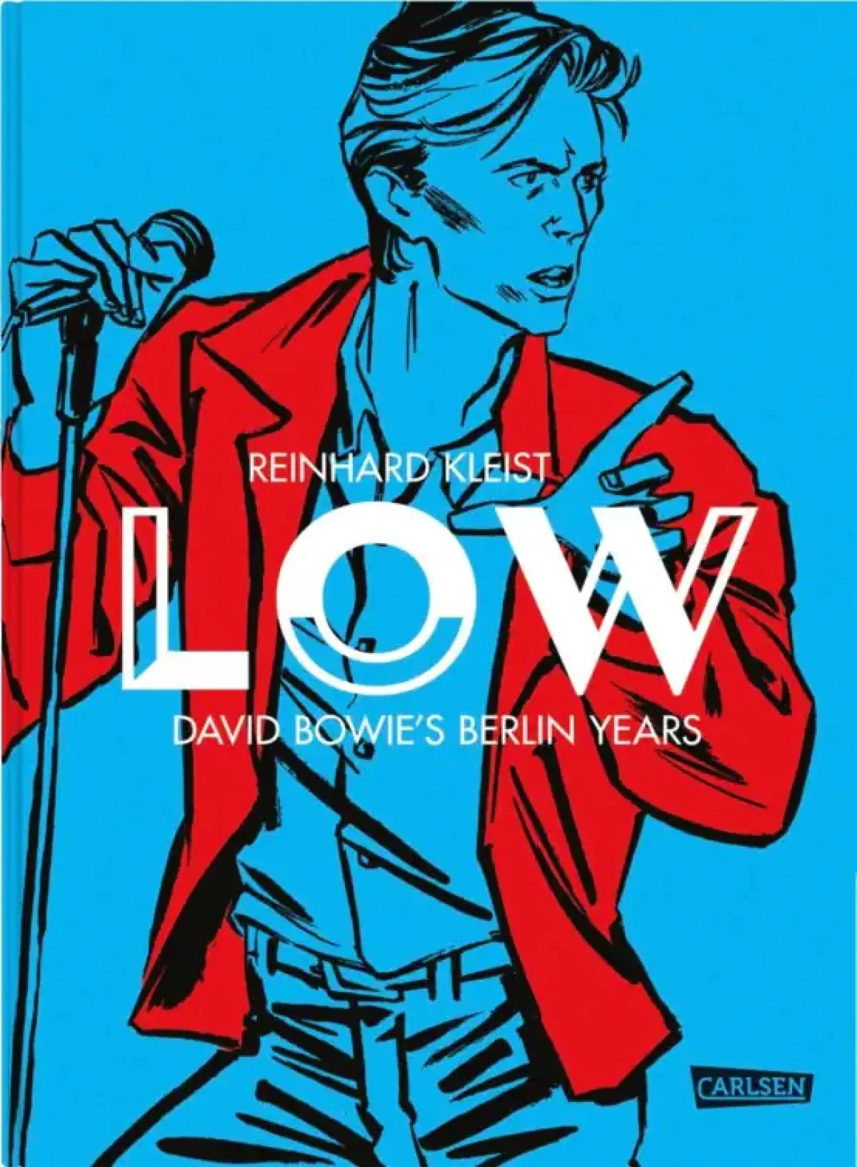
Reinhard Kleist is master of the biographical graphic novel and with Low has produced a work in which he once again devotes himself to the life of music legend David Bowie. However, Low is not just a biography in comic form, but also an artistic exploration of Bowie's complex personality and the changing phases of his life. Starman from 2021 dealt with Bowie's rise in the 1970s, in particular his time as Ziggy Stardust and his transformation into an iconographic figure. Low followed in 2024. The volume is dedicated to the phase after the great success of Ziggy Stardust, when Bowie went through a creative crisis and retreated to Berlin. The comic focuses on the creation of his groundbreaking album Low, which marked the beginning of the so-called "Berlin Trilogy" and initiated a new, experimental path in Bowie's music. Kleist captures the dark yet innovative atmosphere of this period, when Bowie was struggling with personal problems and creative experimentation. For Bowie, his stay in Berlin was a kind of escape, a liberation from the constraints of his previous life.
The narrative is not linear, but jumps back and forth between different time periods. Kleist begins with Bowie looking for an apartment and a scene in which he is working on the recordings for Low in a studio in Berlin. He then inserts flashbacks in almost monochrome colours to show the developments in Bowie's life that led to this album. Themes such as drug addiction, creative blocks and the feeling of alienation from his surroundings and his own role are brought up. And time and again, the Starman floats through the picture as an icon of the past. This fragmentation of the plot also reflects the inner turmoil and chaos in Bowie himself and at the same time reflects the album Low in its mixture of experimental sounds, introspective moments and emotional outbursts. In general, the style of Reinhard Kleist is characterized by clear and expressive lines. He largely dispenses with detailed visual effects and instead opts for a minimalist design that concentrates on the figures and often conceals the backgrounds. The depiction of Bowie, Iggy Pop, Brian Eno or Romy Haag, his Berlin friends, thus takes on a plasticity reminiscent of iconographic photos of these people. In several cases, the images even take over the dialogue, are quasi self-explanatory (see image on the left, p. 61). Visual metaphors, such as the black, red and gold wall view, create a subtext. These pictorial motifs, be they images of records, mirrors or windows, are references to self-reflection, self-searching and alienation. One aspect of the work that is irritating at first glance is the almost garish use of colour. Anyone who has followed Kleist for a long time will be familiar with the expressiveness of his classic black and white contrasts. Here, the intensity of his bold colours is reminiscent of the aesthetics of the 1970s, the album covers and the visual appearance of Bowie at that time. In many scenes, bright pinks, blues and oranges flood the pages with almost psychedelic character. There are moments when the colours literally explode, which is particularly noticeable in the scenes depicting Bowie's drug excesses or his ecstatic musical moments. The use of these colours is certainly not intended to be decorative, but rather to contribute to the mood of the story. They reinforce the atmosphere of confusion, intensity and psychological tension that Bowie experienced during this phase of his life. However, the gloomy bleakness and melancholy that usually shine through in Kleist's shades and harsh contrasts is somewhat lost. The depiction of psychological darkness and inner turmoil, as can also be seen on the cover of Heroes, the second album in Bowie's Berlin trilogy, does not come into its own because the garish colours are sometimes overwhelming and overshadow Kleist's very particular graphic style.
However, if you want to understand Bowie, you won't be disappointed here. Track recommendation for reading the volume: Subterraneans by Low - and of course Heroes is always a good bet!
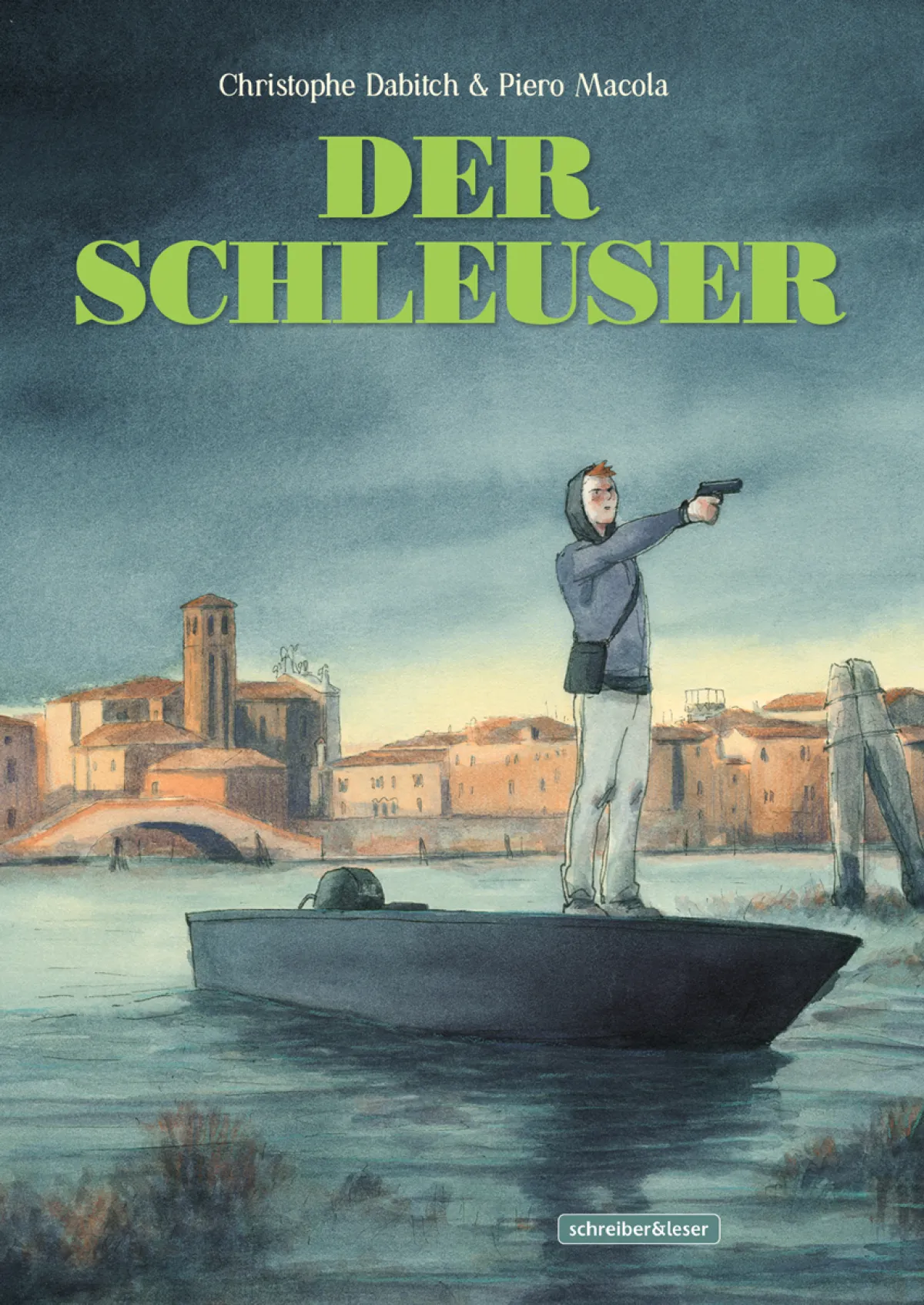
The other Venice! Christophe Dabitch & Piero Macola - The Smuggler: St. Mark's Square, Doge's Palace, Rialto and Bridge of Sighs are off limits: here you get to know Venice from a rather unknown side. Rusty harbour areas, dilapidated barracks on deserted islands, the lagoon itself and its dangerous shallows where you can become fatally stranded - all these play leading roles in this special graphic novel. And just as Venice is seen from an unusual angle, the authors also approach the subject of human trafficking and smuggling from an unusual perspective: Paolo is looking for his father, a fisherman who knows the lagoon inside out, but who has been missing for weeks. Nobody seems to have any idea where he is, but soon you get the impression that the silence is just a wall around a dark secret. So Paolo asks his way through the city's bars and harbour pubs, cruises the lagoon and hopes to find information in the dirty outskirts of the city and in remote houses on lonely islands. Finally, one of his clique's drug deals goes wrong. Paolo gets caught up in a spiral of mysterious criminal machinations. The mafia and traffickers have their fingers in every pie, and the police either look the other way or just watch helplessly. His friendship with his buddy Ahmad, who wants to drag him deeper and deeper into this dangerous cycle, is at stake. Paolo himself is drawn into this world, not of his own accord, but because of the search for his missing father. However, the reality is more complex and he soon becomes increasingly aware of the tangle of criminal networks, the mafia and corruption. The story questions the moral decisions of individuals who live in a system of power and powerlessness in which the line between perpetrator and victim is often blurred. And Paolo has to decide whether he wants to continue with his search, even if the outcome is fatal. But is there even a way out?
Venice, as a city of turmoil, is central - here, not a place of beauty but of decay, abandoned islands and the deadly shallows of the lagoon. The neglected parts of the city, where most of the action takes place, act as a perfect metaphor for the secrets and dark corners where more than just the smuggling business thrives. This unforgiving landscape is not only about survival in the physical world, but also about how far someone is willing to go to find answers - and what compromises they will make along the way.
Piero Macola masterfully brings the dark atmosphere of this situation to life. His drawing style is reduced to the point, and he manages to depict the dreary yet vivid details of the Venetian lagoon in all its decay. The abandoned buildings, the weathered canals and the secret, dark corners of the city are not just backdrops, but active elements of the narrative themselves (see, for example, image on the left, p. 120). The dangerous shallows of the lagoon become a symbol of the uncertain terrain that Paolo physically and morally traverses on his quest. The colour palette is deliberately muted - brown, grey and blue tones dominate the pages. These colours not only reflect the mood of the plot, but also underscore the sense of decay and loss that permeates the entire narrative. Macola uses his clear drawing style to convey the emotional state of the characters and the oppressive atmosphere of the Venetian courtyards and lagoon islands. But the characters' faces are also often marked by pain, anger or resignation, while small graphic details reinforce the feeling of forlornness that Paolo is not the only one to experience during his journey. The style of Piero Macola is in some ways reminiscent of the work of Gipi, particularly in his ability to convey emotions and atmospheres through simple, subtle but powerful drawings. The Smuggler is thus not only a captivating adventure, but also a work that raises the question of what position we ourselves take on the global trade in refugees. Do we go in search of an uncomfortable answer or do we simply take the more comfortable option of closing our eyes?
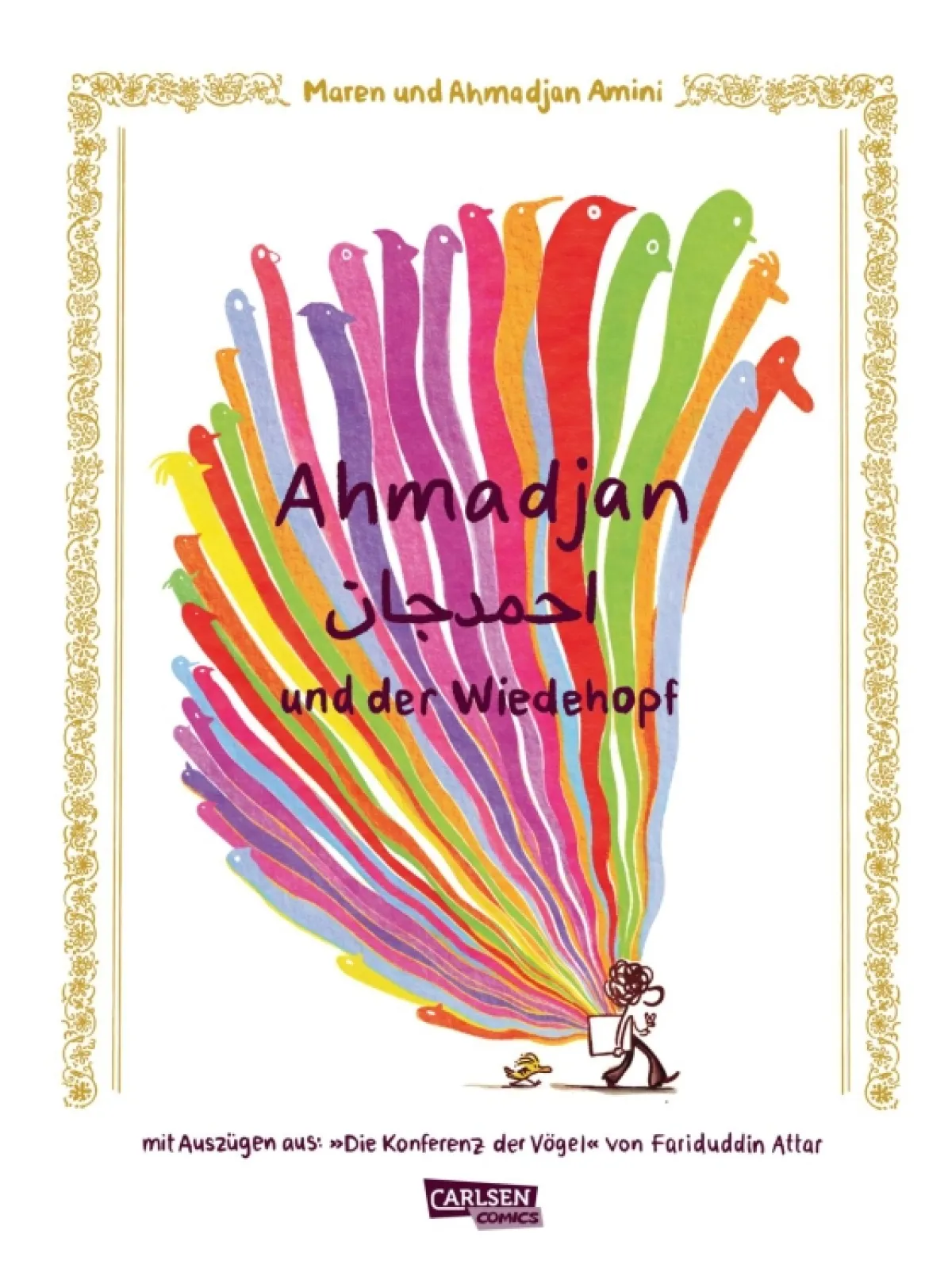
Maren &Ahmadjan Amini | Ahmadjan and the Hoopoe | Carlsen Verlag | 240 pages | 26 EUR
From Arriving! Maren & Ahmadjan Amini - Ahmadjan und der Wiedehopf In a world in which the topics of flight, migration and the clash of different cultures are reported daily by the media, it is no surprise that these complex issues are increasingly being addressed in literature and comics. This work is also an intimate exploration of the themes of home and identity. Maren and Ahmadjan Amini use the figure of the hoopoe - a symbol of hope and transformation - as a common thread to structure their moving story.
Maren Amini, a German cartoonist, illustrator and comic artist, works for Die Zeit, Der Spiegel and the Washington Post, among others. She studied at the University of Applied Sciences in Hamburg and specialized in illustration and comics. Her father Ahmadjan Amini is a graphic designer himself. He was born in Kabul, Afghanistan, and grew up in an environment not directly affected by war. In 1972 he came to Europe. He says: "You didn't need a visa for Germany and could stay for three months. Relations between the two countries were excellent. I flew from Kabul by plane to Tashkent, then on to Moscow, and from there by train via Poland to East Berlin. An official picked me up there and put me straight on the train to West Berlin." Unlike many people from Afghanistan who had to flee the conflicts and wars, Ahmadjan was lucky enough to come to Germany at a time when political relations between Afghanistan and the GDR were still stable.
Ahmadjan Amini concentrated on his professional and artistic development during his time in Germany. In this respect, his biography is characterized less by a dramatic story of flight than by a cultural migration and the search for identity as a migrant in a new country (see e.g. image below, p. 108 f.). The hoopoe, a symbol from Fariduddin Attar's The Conference of the Birds, is a central figure that accompanies Ahmadjan on his journey. The hoopoe functions here not only as a symbol of Ahmadjan's journey, but also as an image for the protagonist's spiritual and identity-forming quest. The hoopoe, which appears in Persian poetry as a guide and bringer of wisdom, leads the birds on a journey of self-discovery. In a similar way, the hoopoe in this comic becomes a guide for Ahmadjan, who is torn between his Afghan origins and his new identity in Germany. The bird reminds Ahmadjan of his roots and at the same time helps him to find his bearings in his new surroundings and find his own identity.
Maren Amini uses her clear, almost minimalist drawing style to depict the complex themes of migration and cultural identity in a concise and pointed way. Her role models are certainly the French caricaturist Georges Wolinski, an illustrator for the satirical magazine Charlie Hebdo, and Sempé in his gentle but precise caricature art. With particular regard to the fine balance between humour and seriousness, he can serve as a reference. Amini uses a similar approach in her comics. Her overdrawn and caricature-like figures and scenes are characterized by an appropriate mixture of wit and seriousness, which offer quick access, allowing the reader to get involved in the story without being overwhelmed by the gravity of the subject matter. The comparison of Ahmadjan and the Hoopoe with The Smuggler by Christophe Dabitch and Piero Macola offers interesting insights into completely different approaches to the topic of migration in comics. While The Smuggler uses gritty, tense realism to tell the story of a boy who gets caught up in the world of human trafficking, Ahmadjan and the Hoopoe is characterized by a more hopeful and conciliatory view of the subject. The hoopoe, which serves as a guide to higher knowledge in The Conference of the Birds, becomes a symbol of survival here. Even though Ahmadjan faces many challenges, the message of the comic remains one of hope and perseverance.
Dinah Wernli | Louise | Edition Moderne | 168 pages | 34 EUR
Muse. Model. Object! Dinah Wernli - Louise: With Louise, Dinah Wernli ventures into a meta-narrative about art and life. The unusual narrative structure of the volume, in which expressive pictorial surfaces are confronted with brief, highlight-like text passages, reflects the protagonist's inner conflict between her life as a farmer and her desires, triggered when she models for the painter Cuno Amiet. We see Louise through the eyes of the painter, as it were, but these images are contrasted by the comments of an authorial narrator. Amiet, one of the most important Swiss artists of the late 19th and early 20th centuries, is known for works marking the transition from realism to expressionism and in which French post-impressionist painting is key .
The volume by Dinah Wernli is dedicated to a very special encounter in the history of the Swiss art world: that between the famous painter and his muse, the young woman Louise Grütter, who lived in the same village in Aargau as Cuno Amiet. She frequently posed for Amiet from 1905 onwards, sometimes whilst breastfeeding her child. He later created experimental half-nudes.
Wernli shows Louise as a figure bordering object and subject - as a model immortalized on canvas and a real person with her own thoughts and feelings. The volume delves deep into the atmosphere of this encounter and shows us Amiet's work through Louise's eyes and vice versa. It is less about the chronological representation of a historical moment and more about capturing the emotions that arose during this collaboration. The question of the relationship between art and life, between the object of painting and the autonomous subject is raised again and again: What does the model trigger in the painter and what does the painting trigger in the model?
"As she sits there
and his gaze rests on her,
she too
begins to see herself.
With its eyes.
With her eyes" (p. 68 f.).
The pictures that Wernli presents in this volume combine Amiet's artistic heritage with the expressive, narrative power of her own depiction. Dinah Wernli's drawing style in Louise is essentially two-dimensional and expressive. Her visual language is characterized by strong, bold colours that underline the emotions and atmosphere of the scenes depicted. In contrast to classic comics, Wernli does not work with the depiction of movement and action, but instead focuses on capturing moments and moods. The drawings appear almost like captured perceptions - calm and introspective. However, it is not about the technical reproduction of a painting by Amiet or the authenticity of the artistic relationship between model and painter, but rather about exploring an emotional connection, whereby the historical perspective becomes a personal one.
Whether Louise should be regarded as a comic or perhaps more as a picture book is ultimately irrelevant. The volume consistently dispenses with the classic features of a comic - such as serial narration or a recognizable panel layout. Instead, Wernli relies on large atmospheric images that contribute to a certain slowness in the narrative style. Although the images are repeatedly combined with texts and dialogue, they are more static than cinematic. The question of whether this volume should actually be considered a comic or not remains open. Wernli invites readers to engage with the visual representation of feelings and moods rather than focusing on a linear story. This creates a different kind of reader experience - one that places more emphasis on the perception and reflection of the images than on the progression of a narrative plot.
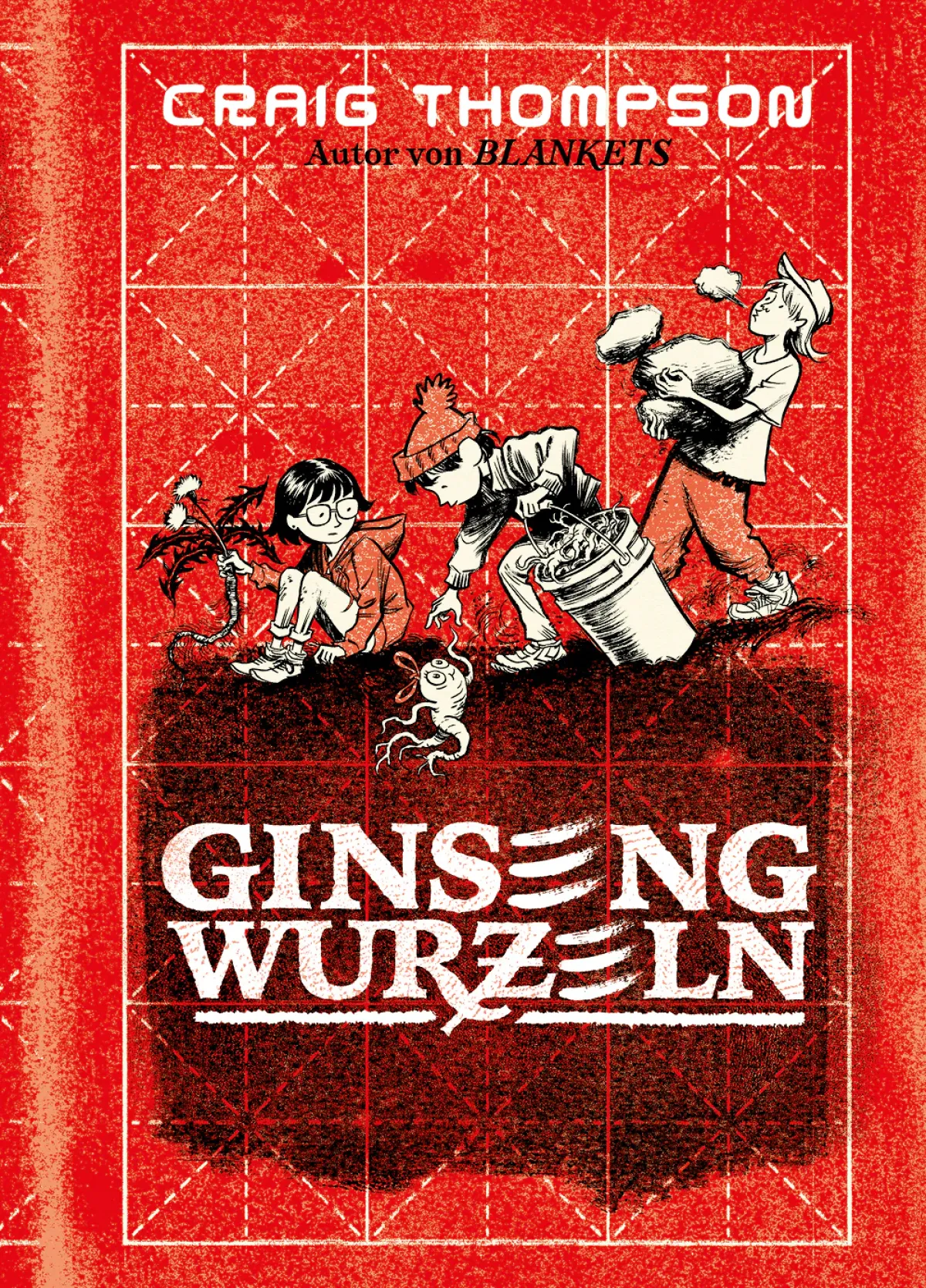
Roots! Craig Thompson - Ginseng Roots:Craig Thompson is known for his epic, personal narratives. The comic combines autobiographical elements - Thompson's childhood in a conservative religious family - with a global perspective on the ginseng trade. The book offers a look back at the author's childhood and youth and at the same time is a journey into the depths of American nature and culture. The author successfully achieves a balance between intimate moments and socio-critical observations. The graphic novel thus places itself in the tradition of John Steinbeck, whose Grapes of Wrath it repeatedly reminds us of.
The plot begins with young Craig and his brother having to help weed and harvest in the ginseng fields in order to contribute to the family's livelihood. Week after week, they swap their meagre earnings for comics. This sets the blueprint for Craig's life: As the story progresses, it quickly becomes apparent that working in the fields is much more than simply an economic endeavour. It becomes a means of self-discovery, a confrontation with the past and a link between the generations. The ginseng harvest is also presented as a rite that symbolizes an important development process for the author. In the course of the story, the children must repeatedly choose between their father's deeply rooted sense of tradition and their own ideas of freedom and independence. It quickly becomes clear that the ginseng is not only a source of life, but one of conflict and challenges within the family; it becomes the starting point for a confrontation with one's own origins. The father is both an almost unshakeable authority and a disturbing figure with reactionary views - the relationship with him is never simple, but always characterized by ambivalence (cf. e.g. picture above, p. 75). Thompson succeeds in making the emotional intensity of this relationship palpable on every page of the book. The ginseng grown in Marathon, Wisconsin, becomes a metaphor for the author's overcoming of challenges. Not for nothing did Thompson himself once say: "My comic art was born out of pain."
Craig Thompson's graphic style is just as distinctive in Ginseng Roots as in his earlier works. The clear lines yet detailed style lead to a realistic depiction, which also impresses with its caricaturistic-humorous reduction and pointedness. He thus stands in the tradition of Will Eisner. To this end, he primarily uses high-contrast black and white, supplemented by red tones. Thompson places particular emphasis on the depiction of landscapes, which take on a personal character, becoming mystical places on several occasions. The trees, the hills, the rivers - they are not just backdrops, but almost acting characters that significantly shape the story.
Craig Thompson follows on thematically from his 2003 masterpiece Blankets. Here, as there, Thompson tells the story of his own youth, his religious conflicts and his struggle with love and family ties. Both works deal with the confrontation with private, social and religious influences and with the expectations of his origins. It shows a mature Thompson who is not afraid to confront his own contradictions.
Jacques Lob & Georges Pichard | Odysseus | avant Verlag | 160 pages | 39 EUR
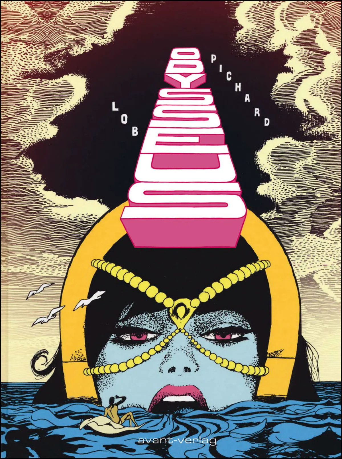
Overhauled! Jacques Lob & Georges Pichard - Odysseus: The volume Odysseus by Jacques Lob and Georges Pichard, published in the early 1970s, is a product of its time. It takes the story of the Greek hero and interprets it within a primarily erotic framework. This combination of mythology and explicit eroticism was an attempt to question and deconstruct the prevailing norms in literature and art at the time - a subversive act, so to speak, in the spirit of the counterculture and the sexual liberation trend of the 1960s and 1970s. The volume can therefore be seen as an artistic experiment of its time, but we have to ask whether its thoroughly sexist view is still appropriate, not least because of the problematic depiction of women.
In the epilogue 'Weder Gott noch Staat. Ode to Anarcho-Eroticism', Boris Battaglia and Paolo Interdonato write: "The soft flesh of Georges Pichard's drawings aroused us from an early age. And we still haven't got enough of them." The statement is not free of embarrassment and smacks of elderly white male. A more critical reflection would be appropriate here: After all, the portrayal of women in Ulysses is undoubtedly objectively problematic. In their appearance alone, Penelope, Circe and Calypso, for example, are practically indistinguishable from one another. In Pichard, they are stylized as female figures who are less illuminated from a mythological perspective, but rather function as objects of desire for the hero.
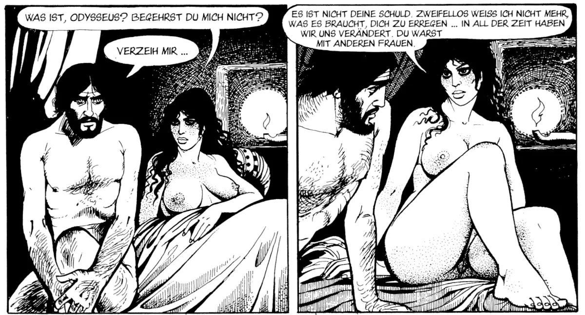
While this aesthetic presented itself as anarchic and liberating in the 1970s under the umbrella of the sexual revolution and a far-reaching liberalisation of physicality and sexuality, it is increasingly being critically questioned today. In the context of the sexual revolution, the depiction of eroticism should probably be understood as a form of liberation from old moral norms. However, the all too often purely objective portrayal of female figures must be perceived today as problematic and sexist. Symptomatic of this is the final sequence, when Penelope guiltily projects Odysseus' erection problems onto herself (see image top right, p. 139).
Here lies a field of tension that also accompanies the discourse surrounding the republication of these works. While Homer's Odyssey is a slowly unfolding, complex tale of home, loss and deprivation in a patriarchal world whose stereotypes are repeatedly addressed and questioned in many modern adaptations, Pichard's volume seems to ignore this thematic web and concentrate entirely on the sensual, pleasurable side of the myth. Where Homer's work still focuses on the dramatic conflicts of the characters and the sacrifices of their decisions, Pichard's narrative is far simpler. The deeper philosophical and psychological dimension that characterizes the original is largely lost in the comic adaptation.
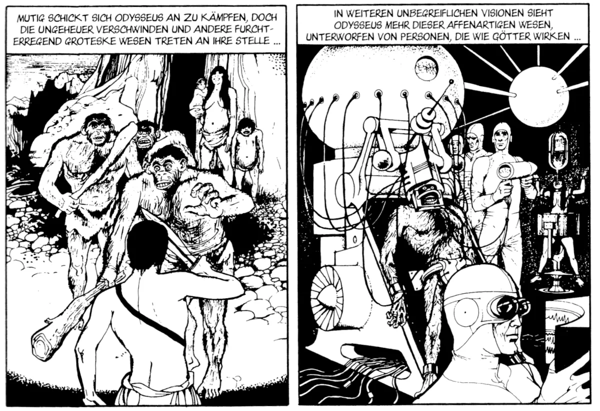
Although Odysseus is primarily perceived as an erotic comic, elements of science fiction can certainly be found in the adaptation. The use of Homer's mythological framework is an opportunity for Pichard to expand the myth in a futuristic or speculative direction. But here, too, a very contemporary and outdated pseudo-scientific idea dominates, reminiscent of Erich von Däniken: in Homer's original text, for example, Hades is a dark, mysterious place where Odysseus communicates with the shadows of the dead in order to gain a deeper insight into human existence. In the classic work, the dead are witnesses of the past and the messages Odysseus receives are often messages of wisdom concerning human nature. But Pichard, who not only draws on the mythological but also introduces a modern, speculative reading, transforms Hades into a setting that addresses the development of the entire human being - and in a crudely futuristic way: The gods have a movie screening room here, in which recordings of evolution can be viewed, making it clear that they are always at the helm(see image above, p. 93).
The question of whether the reissue of works such as Odysseus or the erotic comics by Guido Crepax still makes sense today must therefore be considered from different perspectives. Is it enough to edit the volume in terms of cultural relevance at a certain time, when the critical examination of gender images and sexual norms has taken a completely different turn? More likely: there is still a market for these kinds of comics, which function as memorabilia for an aging readership that has a nostalgic attachment to the works.


 © Reprodukt Verlag
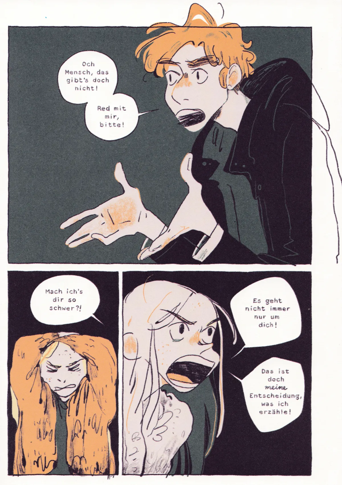
 © avant Verlag
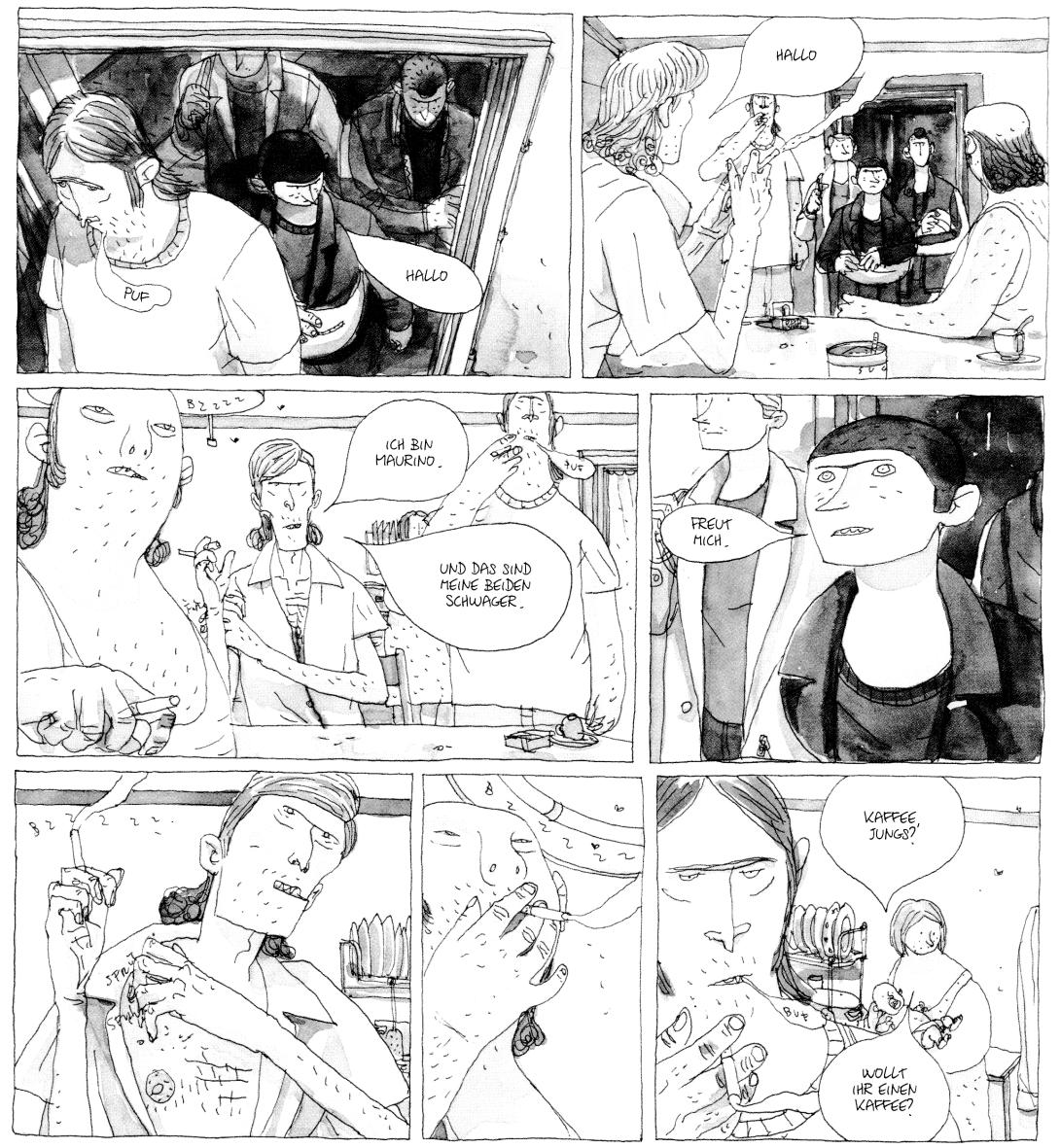
 © Edition Moderne
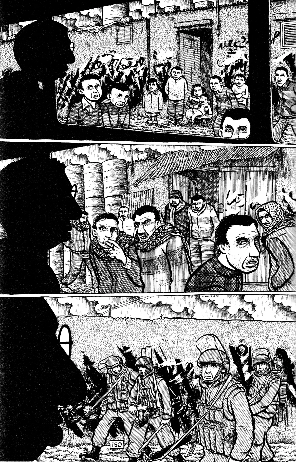
 © Carlsen Verlag
 © schreiber&leser
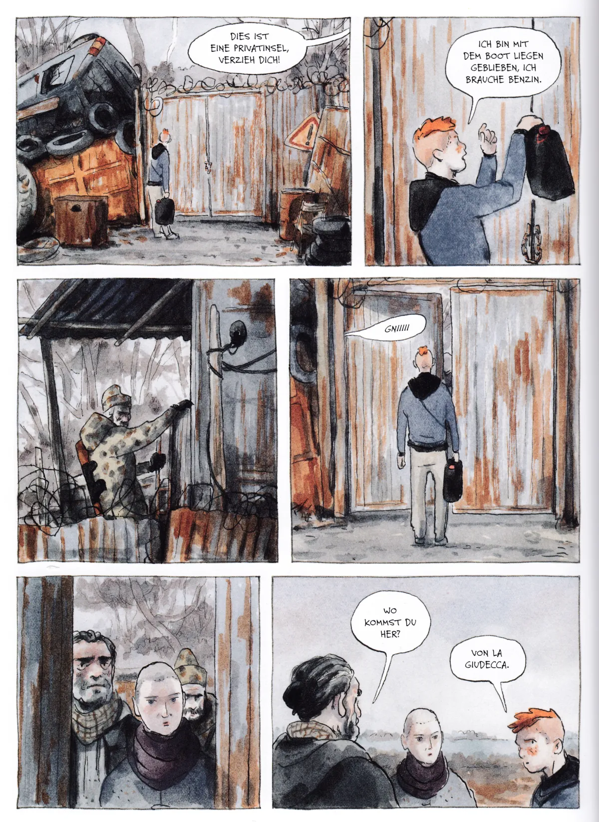
 © Carlsen Verlag
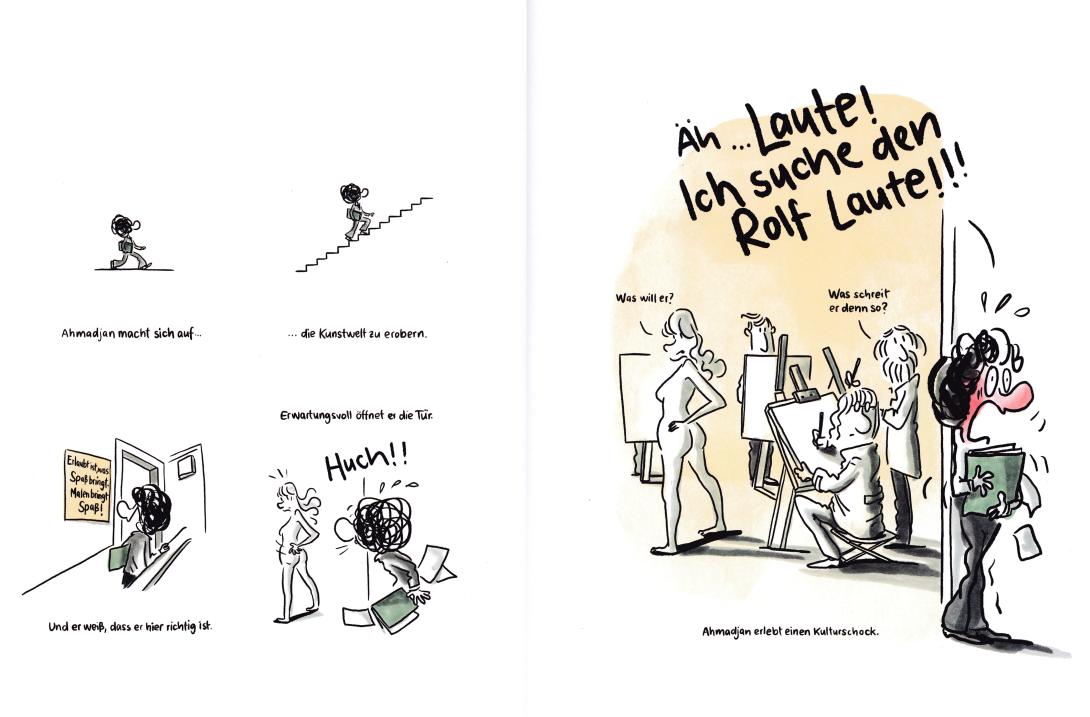
 © Edition Moderne
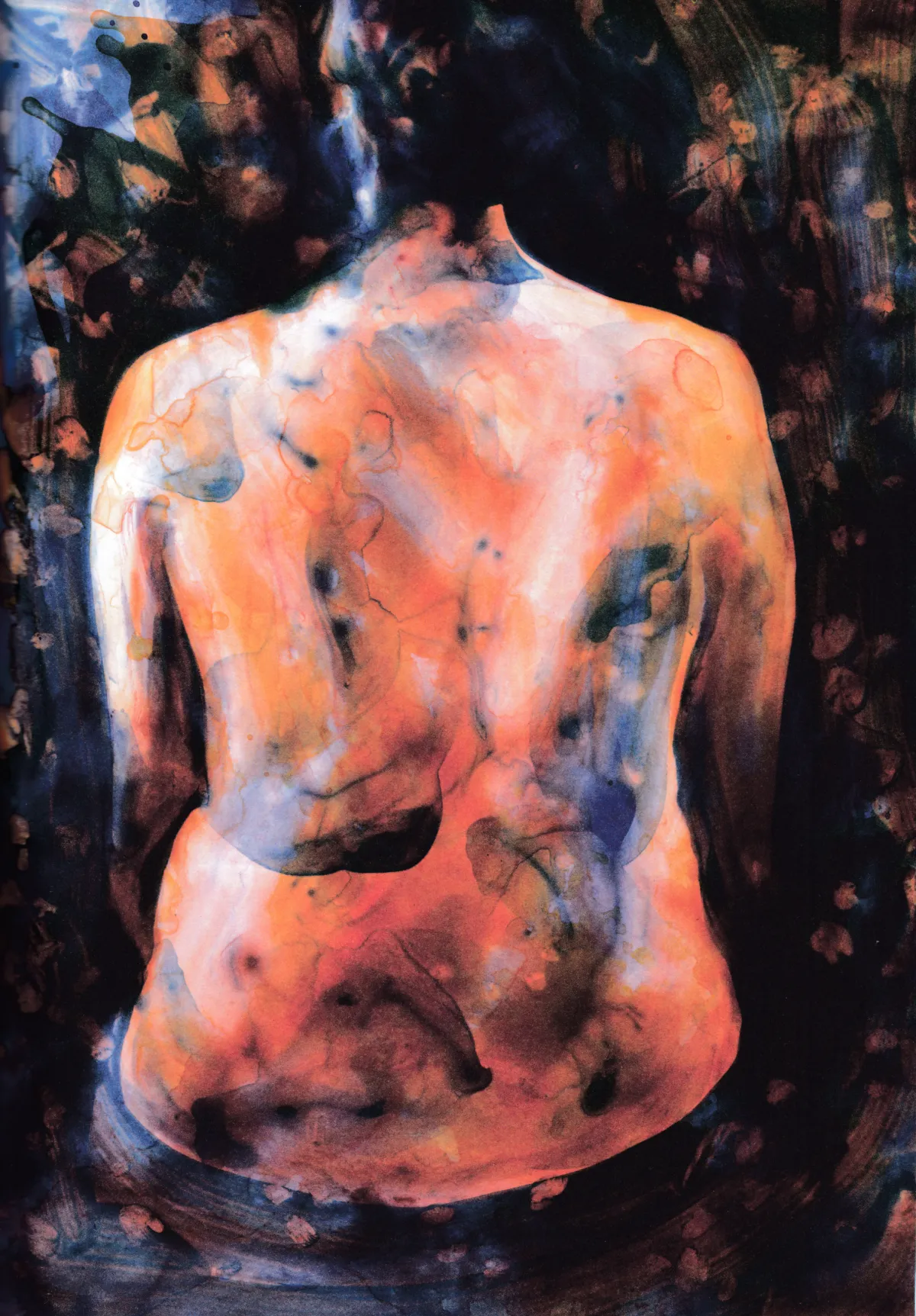
 © Reprodukt
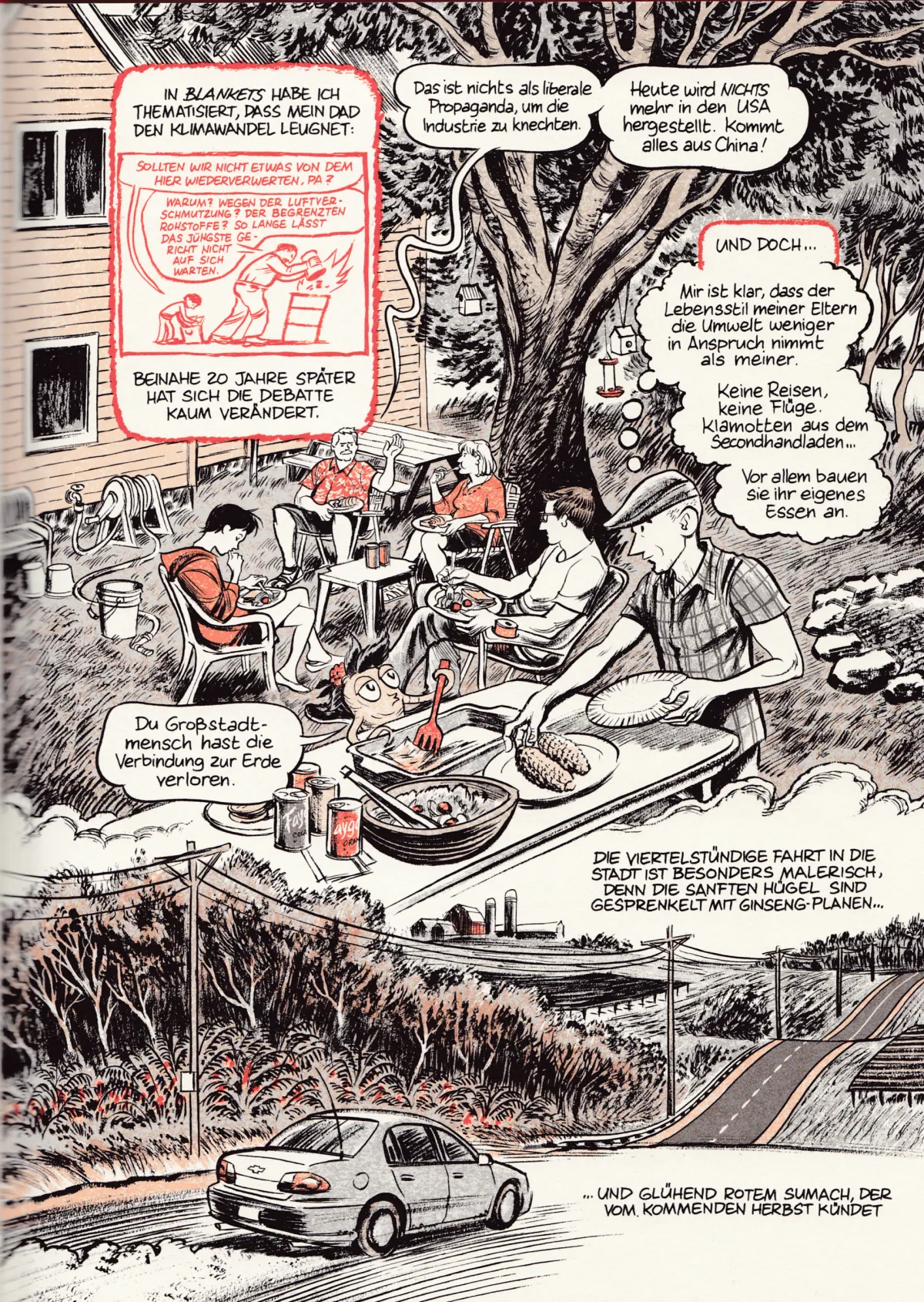
 © avant Verlag